Style, design and close ties to home and fans for the new kits of the Canadian Premier League

The milestone fifth season of the Canadian Premier League begins this weekend, with all players kitted out in new Primary and Alternate match kits developed and produced by Macron, technical partner and official supplier to all eight clubs since the League’s inception.
On 15 April, Ottawa's TD Place Stadium will be the first to stage an official match in the League’s fifth season. The host, Atlético Ottawa, will be pitted against Halifax Wanderers FC. A few hours later it will be the turn of the reigning champions, Forge FC, to play at home at Tim Hortons Field against Cavalry FC. Opening weekend will also see the first British Columbia derby played between Pacific FC and expansion side Vancouver FC at Starlight Stadium in Langford, B.C. on Saturday, with York United FC and Valour FC wrapping up the action on Sunday.
All new Primary and Alternate match kits developed and produced by Macron have now been presented ready for the kickoff of the new championship. Each CPL kit is fully customised, with exclusive graphics representing landmarks from the teams' home territories as well as the home cities and historical roots of each club.
The feature the words “FOR CANADIANS, BY CANADIANS” on the inside label, along with the motto “We are MANY We are ONE” on the back. The kits also convey a clear message of environmental sustainability as they are made from Eco Fabric, a material derived entirely from recycled plastic in confirmation of the green policies shared by Macron and CPL.
FORGE FC
The new primary shirt of the current champion, Forge FC, is in the club's classic orange with dye-sub graphics representing the chain that appears on the flag of Hamilton. The alternate shirt features a black and grey geometric pattern at the front, decorated with details in orange, the club's colour.
PACIFIC FC
The pride of Vancouver Island is clearly conveyed by the primary shirt of Pacific FC. The colour purple expresses the soul of the island along with an image of the spirit bear, the white bear that symbolises British Columbia. The away kit is in sea green in homage to the Island's western coast and features references to the surfing, camping and canoeing for which this region is famous.
CAVALRY FC
Community, love for the land and history are the motifs found on the shirt of Cavalry FC. Red and black merge in a shaded diagonal band, complemented by dye-sub graphics representing the Alberta countryside, with its wide range of scenery, from prairies to mountains. On the back of the shirt, again in a dye-sub print, appears the image of a buffalo, a symbol of strength and resilience and the animal that best symbolises the territory. The second match shirt is in total black and is decorated with natural images such as lightning, the night-time sky and the mountains, depicted in red and green details on the collar and sleeve cuffs.
VALOUR FC
The new first game shirt of Valour FC is in garnet red with black and gold details. Its graphics convey the close ties between the club and the city of Winnipeg, with a subtle, dye-sub print depicting the city's roads. The alternate shirt is in total-black with vintage effect graphics. The most distinctive feature is a motif representing three claw marks ripping the surface to reveal the club's classic colour beneath.
YORK UNITED FC
The new primary shirt of York United FC is mainly white but with a diagonal band in the classic green, blue and gold colours, connecting the club's past with its present. A light relief graphic on the sleeves and shoulders represents the contour of Roy Thomson Hall, the iconic building in the heart of Toronto's entertainment district. The design of the away shirt, in green with blue sleeves and collar, is also inspired by the city's famous landmarks. The pattern that repeats on the front and back outlines the angular shape of the Royal Ontario Museum, a great example of modernity and classicism, innovation, and artistry – key aspects of the club's identity.
ATLÉTICO OTTAWA
The classic vertical white and red stripes of Atlético Ottawa's new shirts have been enriched by mimetic graphics in the red stripes of the front. The back is all in red with a dye-sub print of the city's outline, which forms a heart shape. The second shirt is inspired by the rigid climate of Ottawa, one of the coldest capital cities in the world: a dye-sub motif simulating an icy surface repeats all over the shirt, excluding only the sleeve cuffs and the neck which have navy blue details.
HALIFAX WANDERERS
The primary kit of Halifax Wanderers is in navy blue with grey details and is characterised by tone-on-tone graphics depicting the black granite rocks shaped by the sea. The alternative shirt is in white with a rainbow motif around the neck and sleeve cuffs in homage to the community of Halifax and the diverse backgrounds of its residents. The message “Together From Aways” appears repeatedly over the front of the shirt and on the sleeves.
VANCOUVER FC
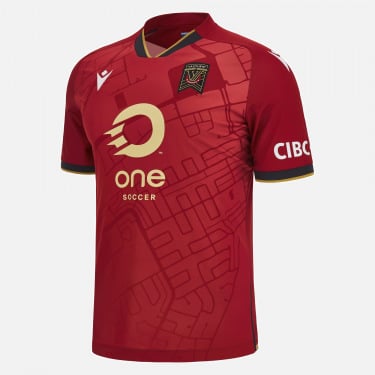
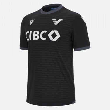
Vancouver FC only joined the Canadian Premier League this year. The club's new first shirt is in red with three large, horizontal black stripes. The choice of red, along with the maple leaf printed at the back of the neck, are homages to Canada and the people who helped promote the sport of football there. The second match shirt is all in black and is dedicated to the Greater Vancouver district. The names of the 53 towns and municipalities that make up the district appear in relief graphics, confirming the club's close ties with the area and its community.
The shirts of all eight clubs can be purchased from the section of the macron.com website dedicated to the Canadian Premier League.


