Symbols, local connections and artistic graphics adorn the Canadian Premier League’s 2024 Macron kits

The sixth season of the Canadian Premier League (CPL) kicks off this weekend, with the eight clubs taking to the pitch sporting another standout collection of eye-catching bespoke kits designed and made by Macron, the technical partner and official supplier to the CPL since the League’s inception in 2019.
The whistle marking the start of the 2024 CPL season will blow on Saturday, April 13, when Atlético Ottawa host York United FC in Canada’s capital of Ottawa, Ontario. It’s the start of a CPL tripleheader, with Forge FC later welcoming Cavalry FC at Tim Hortons Field in Hamilton, Ontario, a repeat of the 2023 CPL Final, before Pacific FC hosts Halifax Wanderers at Starlight Stadium in Langford, British Columbia to close out the day’s action. The first CPL matchweek in 2024 will end in Langley, British Columbia, on Sunday, April 14, when host Vancouver FC takes on Valour FC.
Each 2024 CPL kit conveys the identity of the team that wears it and embodies not only the close ties between the players and their communities but their shared values, too. The new kits are all made from Eco Fabric, a material derived entirely from recycled plastic that expresses a clear message of environmental sustainability and supports Macron and the Canadian Premier League’s shared commitment to being environmentally aware and friendly.
ATLÉTICO OTTAWA
Atlético Ottawa maintains its classic red and white stripes for this season’s Primary kit, but this time the colours are enriched by a diagonal optical motif in two different shades. The shirt also bears the words “For Ottawa” and “Pour Ottawa” in the two official languages of the Province of Ontario, English and French. The Alternate kit features a striking design that pays homage to the Radiant O, the symbol of Ottawa Tourism, which represents the city’s welcoming, inclusive feel. A fragmented Radiant O has been reproduced with a spray effect, creating an explosion of colours that underscores the spirit of the club and the city.
CAVALRY FC
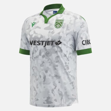
The province of Alberta has close ties to the high-tech industry. Those ties have inspired Cavalry FC’s red Primary kit, named the Innovation City Kit for this very reason. The province’s connection to the high-tech industry is represented by a diagonal graphic in the centre of the shirt, appearing in white against the kit’s red backdrop. The Alternate kit, named the Northern Lights Kit, is mainly green with complementary red and white details, paying homage to the aurora borealis and to the Pegasus constellation, both of which can be seen from Calgary, the CPL and Concacaf’s northernmost city. The Pegasus constellation is also a tribute to Cavalry’s home on the shared grounds of world-class show jumping venue Spruce Meadows. For the first time, Cavalry has also designed a Third kit this season, the Blizzard Camouflage Kit, which boasts a grey and white mimetic motif inspired by the club’s inaugural home match, which was played amidst heavy snowfall and on a frozen pitch. The camouflage pattern also gives a nod to the military and its ties to both Cavalry and Spruce Meadows.
FORGE FC
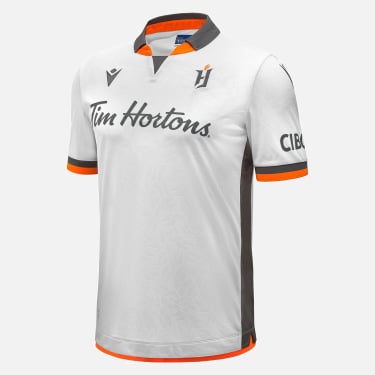
For its Primary shirt, the reigning 2023 CPL Champions kept the colour orange that has long been synonymous with the club, while introducing a new, abstract, geometric pattern depicting the sparks of a forge. The club’s Alternate shirt is white with orange and anthracite black details on the neck, sleeve cuffs and sides. The embossed graphics depict the sparks of the club’s logo.
HALIFAX WANDERERS
The Wanderers 2024 Primary Kit, designed in the club’s iconic Harbour Blue, features repeating maps of Nova Scotia on the front of the jersey and sleeve, with small anchors marking the location of Halifax on the map pattern. A compass rose with the slogan ‘Not all those who wander are lost, they’re seeking a place to call home’ is sublimated on the back. The Atlantic Ocean provides the theme for the Alternate kit, with the colours blue and white weaving through silhouettes of such ships as the Bluenose II and the HMCS Sackville. The kit honours Atlantic Canada’s spirit for innovation, embodied in the region’s history of shipbuilding.
PACIFIC FC
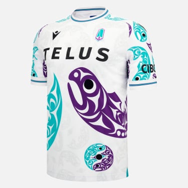
Pacific FC’s new Primary shirt expresses the spirit of the Vancouver Island in the form of a trident, which can also to be found in the club’s logo, repeated in embossed graphics all over the kit. The club’s new Alternate kit, the Resilience Kit, features designs created by local artist Maynard Johnny Jr and speaks to the resilience shown by Indigenous people in Canada as they survived years of oppression through images of a salmon. The mainly white kit also features the club’s traditional purple, turquoise and black details.
VALOUR FC
Valour FC’s new Primary kit features two horizontal garnet stripes at the top, with complementing vertical, tone on tone grey and white stripes at the bottom. It pays homage to Winnipeg’s first professional soccer club, the Fury, who played in the Canadian Soccer League from 1987 to 1993 and was later inducted into the Manitoba Sports Hall of Fame. The club’s Alternate kit features a sunflower at its centre, with the Prairie Crocus highlighted on the kit’s four corners. The elaborate design pays homage to Indigenous art in the club’s colours of maroon, gold, black and white.
VANCOUVER FC
Vancouver FC’s Primary kit is inspired by the eagle that appears in the club’s logo. A grey on black dye-sub print representing feathers starts at the shoulders and extends down the back, fading out at the bottom. The Alternate shirt pays homage to one of the most characteristic springtime events in the Vancouver area, the flowering of more than 40,000 cherry trees within the city’s metropolitan area. The entire shirt is pink with cherry blossom petals in various shades covering the front and back.
YORK UNITED FC
White is the dominant colour of York United FC’s Primary kit. The front of the shirt features a design based on vertical blue stripes with gold edges, alternating with five slender green lines and recalling the graphics of the club’s logo. The Alternate shirt is inspired by the world of fashion and boasts a checkered motif in alternating blue and green.
All eight clubs’ kits can be purchased from the Canadian Premier League section of the macron.com website.


